> ## Documentation Index
> Fetch the complete documentation index at: https://engage-docs.frigade.com/llms.txt
> Use this file to discover all available pages before exploring further.
# Theming
The easiest way to get Frigade components integrated into your designs is by customizing the base theme that all of our components inherit from.
The base theme covers common style properties like colors, typography, spacing, and borders. If you need deeper customization, you can dig into CSS overrides or even custom components.
To override the base theme, pass the properties you want to change into the `theme` prop of the `Provider` component. In the example below we override the default blue primary color to be `#000000`:
```tsx theme={"system"}
```
## Tailwind CSS and Shadcn
If you're using Tailwind CSS with Shadcn, you can use the `theme` mappings below to automatically match your existing theme.
```tsx theme={"system"}
```
If using a `` to enable theming such as dark mode, make sure the `` is a child of the `` component.
## CSS Variables
Our theme runs on a set of [CSS custom properties](https://developer.mozilla.org/en-US/docs/Web/CSS/Using_CSS_custom_properties) that map 1:1 to the properties in the theme. For any part of the theme, you can override the related CSS var and any themed value in that CSS scope will be changed accordingly.
This is especially useful in conjunction with the `css` prop, as it allows you to create temporary sub-themes that apply only to one Component, e.g.:
```tsx theme={"system"}
```
The full list of CSS variables used in our theme can be found [here](/sdk/styling/css-variables).
## Finding a specific theme variable
You can use your browser's developer tools to inspect the CSS properties of any Frigade component. For instance, to find the theme variable for the secondary text in the [Form](/component/form) component, you can inspect the element and look for the `color` property:
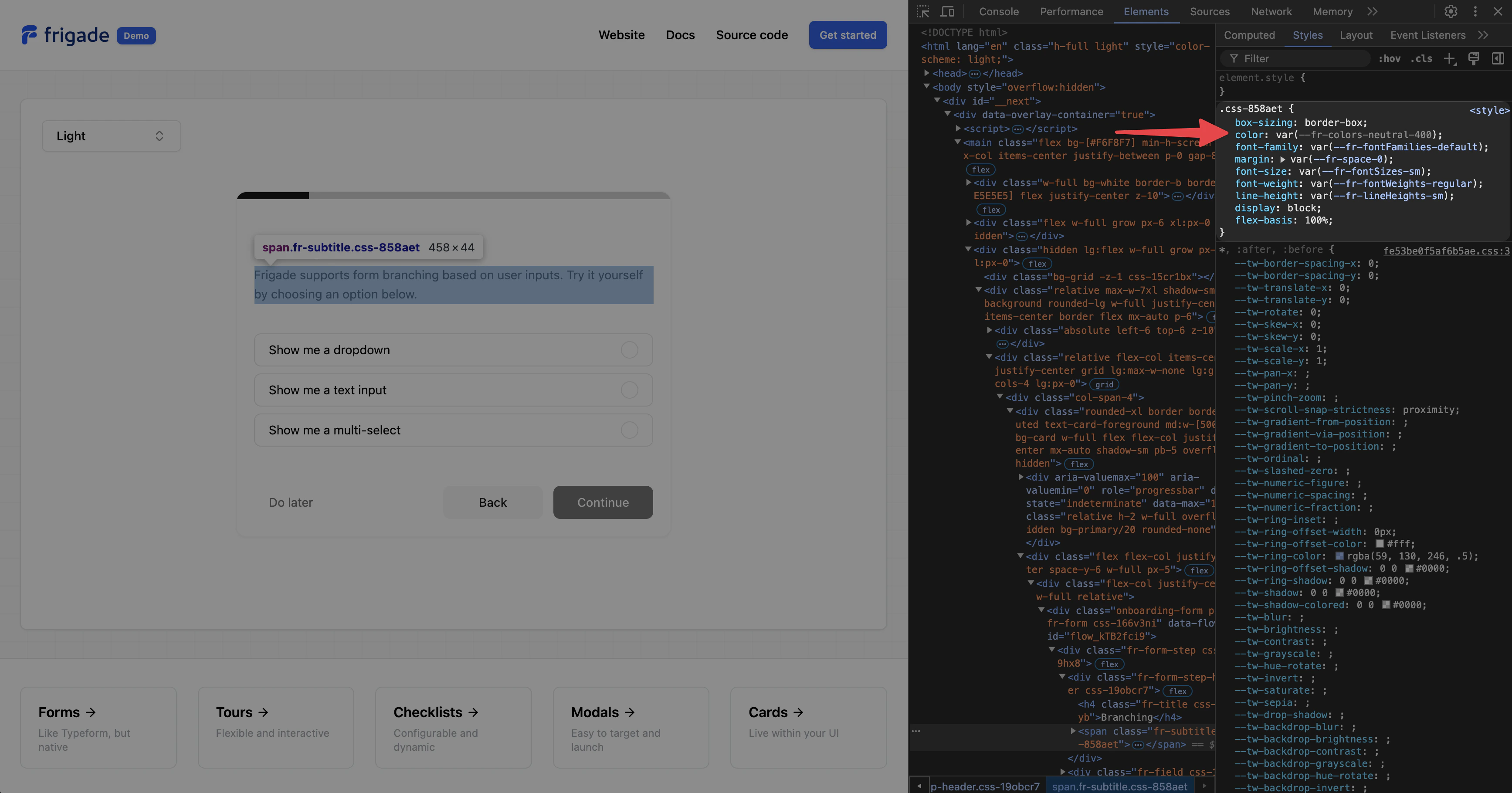 In the above example, we see that the theme variable is `--fr-colors-neutral-400`, which also corresponds to `colors.neutral.400` in the theme object.