> ## Documentation Index
> Fetch the complete documentation index at: https://engage-docs.frigade.com/llms.txt
> Use this file to discover all available pages before exploring further.
# NPS Survey
> Collect structured and freeform feedback from your users
## About this component
The `Survey` component is a fantastic way to engage users right when it matters and gather valuable feedback or data. Whether you’re looking to measure satisfaction or collect insights, targeted in-app surveys can help you connect with users at key moments in their journey.
**When to Use Surveys:**
* **User Research:** Deploy surveys like NPS (Net Promoter Score) right after users complete specific actions. This is a great way to capture their feelings while the experience is fresh in their minds.
* **Data Collection:** Use surveys to collect additional data after user signups, helping you enrich your CRM and tailor your communications.
**Best Practices for Surveys:**
* **Flexible Display Options:** By default, NPS surveys typically float on the screen, ensuring they don’t take over the entire user experience. This keeps the process smooth and non-intrusive.
* **Full-Screen Takeovers:** For the highest engagement rates, for custom surveys or other input forms, they can be displayed inline within the page or as a full page modal. Just be sure to use these methods thoughtfully to avoid annoying users.
**Custom Surveys:**
* **Built on Forms:** Custom surveys utilize the same underlying components as Forms, which means you can refer to the Forms documentation for more details on how to create and implement them effectively.
## Resources
* Launch surveys with no-code using [Collections](/platform/collections#announcements-surveys-and-dialogs)
* Target your survey to specific users with [Targeting](/platform/targeting)
* See [industry examples](https://www.productonboarding.com/?type=survey) of surveys
## Demo
* See surveys in action in our [live demo](https://demo.frigade.com/modals)
## Alternative scales
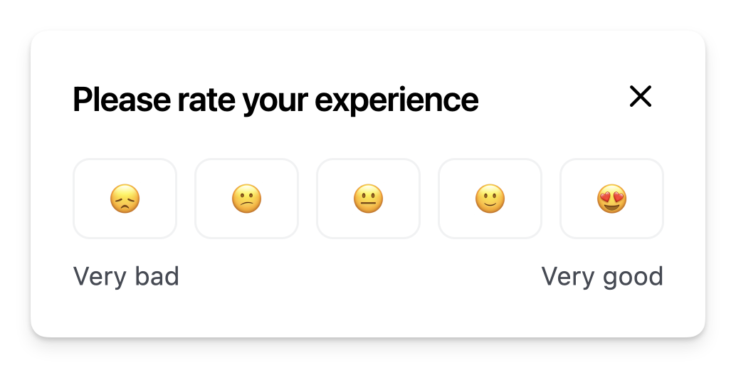
The component comes with a default NPS scale of 0-10. You can also use a custom scale by passing the `options` property either directly in the React component or in the YAML config via the `props` property. For instance, in the example below, we're using an emoji scale:
```Typescript App.tsx theme={"system"}
import * as Frigade from '@frigade/react';
const App = () => {
return (
);
};
```
## Installation
```tsx theme={"system"}
import * as Frigade from '@frigade/react';
const App = () => {
return (
);
};
```
NPS Surveys can be be deployed with no-code using [Collections](/platform/collections).
## Customization
To learn about how to customize Frigade components, see the [customization documentation](/sdk/styling/) and [examples](https://demo.frigade.com) of custom themes in action.
## SDK Properties
Optional component to wrap the child components in, e.g. `as={Dialog}` will render the Flow in a modal Dialog. Defaults to `Box`.
Whether to automatically mark the Flow started (i.e. in progress) when the Flow is eligible to be shown.
You will need to call `flow.start()` or `step.start()` from the parent component if you set this to `false`. Most components should not need to override this behavior.
Defaults to `true`.
Emotion CSS prop to apply to the component. See [Theming documentation](https://docs.frigade.com/v2/sdk/styling/css-overrides) for more information.
Example usage:
```
```
Whether the Flow is dismissible or not
Custom field types to be used in the Form.
You can use this to build your own custom form fields in a `Form`.
For example, if you want to use a custom field type called `calendar`:
```tsx theme={"system"}
import { Form, FormFieldProps } from "@frigade/react";
function CalendarField({ field, submit }: FormFieldProps) {
return (
);
}
// ...
;
```
The Flow ID to render. You can find the Flow ID in the Frigade dashboard.
If true, the Flow will be mounted even if it has already been completed or dismissed.
However, if the user does not match the Flow's targeting, the Flow will not be mounted.
Register the Flow as a modal to prevent popup collisions (only one modal Flow will render at a time).
The label to display for the negative end of the NPS scale.
If not provided, the default label "Not likely at all" will be used.
Handler for when the Flow is completed. This is event is fired immediately after the user completes the Flow.
Handler for when the Flow is dismissed (skipped). This is event is fired immediately after the user dismisses the Flow.
Handler for when primary button is clicked.
If this function returns false or a promise that resolves to `false`, the step will not be automatically completed when clicked.
Handler for when secondary button is clicked.
If this function returns false or a promise that resolves to `false`, the step will not be automatically completed when clicked.
The options to display in the NPS field.
If not provided, the default NPS numbers from 0 to 10 will be used.
The label to display for the positive end of the NPS scale.
If not provided, the default label "Extremely likely" will be used.
Variables to pass to the Flow. You can use variables in the Flow configuration to customize copy.
For instance, you can use `title: Hello, ${name}!` in the Flow configuration and pass `variables={{name: 'John'}}` to customize the copy.
The individual steps/pages of the form
Unique identifier for the step. Do not change this once the step has been created.
The title of the step
The description of the step
Url to an image to display in the step
Url to an icon to display in the step. This is only supported by the carousel checklist component.
Url to a video to display in the step such as YouTube, Vimeo, or a direct link to an mp4 file
Config for the primary button in this step.
Primary button action. (defaults to step.complete). **Possible values:** `false`, `flow.back`, `flow.complete`, `flow.forward`, `flow.restart`, `flow.skip`, `flow.start`, `step.complete`, `step.skip`, `step.reset`, `step.start`
Primary button URI target (defaults to \_self).
Primary button title. If omitted, the primary button will not be shown.
Primary button URI.
**Deprecated**: use `primaryButton.title` instead. The title of the primary button
**Deprecated**: use `primaryButton.uri` instead. The url to open when the primary button is clicked
**Deprecated**: use `primaryButton.target` instead. The target of the primary button url (default: \_blank; use \_self to open in the same window). Setting it to # will open the existing page and dismiss any Frigade modals.
Config for the secondary button in this step.
Secondary button action. (defaults to step.complete). **Possible values:** `false`, `flow.back`, `flow.complete`, `flow.forward`, `flow.restart`, `flow.skip`, `flow.start`, `step.complete`, `step.skip`, `step.reset`, `step.start`
Secondary button URI target (defaults to \_self).
Secondary button title. If omitted, the secondary button will not be shown.
Secondary button URI.
**Deprecated**: use `secondaryButton.title` instead. The title of the secondary button
**Deprecated**: use `secondaryButton.uri` instead. The url to open when the secondary button is clicked
**Deprecated**: use `secondaryButton.target` instead. The target of the secondary button url (default: \_blank; use \_self to open in the same window). Setting it to # will open the existing page and dismiss any Frigade modals.
Targeting that automatically completes the step. E.g.: user.property('connectedBank') == true
Targeting that automatically blocks the step from starting until it becomes true. E.g.: user.property('connectedBank') == true
Targeting that automatically shows the step when it becomes true. E.g.: user.property('connectedBank') == true
Override the default UI props for the corresponding component
The data contained on the form step, typically text input boxes, multiple choice questions, etc.
Unique identifier for the step. Do not change this once the step has been created.
The label of the field
The default value of the field (used for prefilling). For checkboxes, use 'true' or 'false'.
Whether the field can accept multiple values. Only used for the `select` type field.
The type of the field. The built-in supported types are: `text`, `textarea`, `select`, `checkbox`, and `radio`. If you are using custom form field types, the name here should match it.
The placeholder of the field
The maximum length of the field
Whether the field is required or not. Use a string here to show a custom error message.
The options for the field. Only used for select fields.
The label of the option
The value of the option
The validation rules for the field. See documentation for more information.
Regex pattern to match the field against
The error message to display if the pattern does not match
Optional additional properties for the field. These will be passed to the frontend component as HTML attributes and merged with the default props for the given field type.
 ## About this component
The `Survey` component is a fantastic way to engage users right when it matters and gather valuable feedback or data. Whether you’re looking to measure satisfaction or collect insights, targeted in-app surveys can help you connect with users at key moments in their journey.
**When to Use Surveys:**
* **User Research:** Deploy surveys like NPS (Net Promoter Score) right after users complete specific actions. This is a great way to capture their feelings while the experience is fresh in their minds.
* **Data Collection:** Use surveys to collect additional data after user signups, helping you enrich your CRM and tailor your communications.
**Best Practices for Surveys:**
* **Flexible Display Options:** By default, NPS surveys typically float on the screen, ensuring they don’t take over the entire user experience. This keeps the process smooth and non-intrusive.
* **Full-Screen Takeovers:** For the highest engagement rates, for custom surveys or other input forms, they can be displayed inline within the page or as a full page modal. Just be sure to use these methods thoughtfully to avoid annoying users.
**Custom Surveys:**
* **Built on Forms:** Custom surveys utilize the same underlying components as Forms, which means you can refer to the Forms documentation for more details on how to create and implement them effectively.
## Resources
* Launch surveys with no-code using [Collections](/platform/collections#announcements-surveys-and-dialogs)
* Target your survey to specific users with [Targeting](/platform/targeting)
* See [industry examples](https://www.productonboarding.com/?type=survey) of surveys
## Demo
* See surveys in action in our [live demo](https://demo.frigade.com/modals)
## Alternative scales
The component comes with a default NPS scale of 0-10. You can also use a custom scale by passing the `options` property either directly in the React component or in the YAML config via the `props` property. For instance, in the example below, we're using an emoji scale:
## About this component
The `Survey` component is a fantastic way to engage users right when it matters and gather valuable feedback or data. Whether you’re looking to measure satisfaction or collect insights, targeted in-app surveys can help you connect with users at key moments in their journey.
**When to Use Surveys:**
* **User Research:** Deploy surveys like NPS (Net Promoter Score) right after users complete specific actions. This is a great way to capture their feelings while the experience is fresh in their minds.
* **Data Collection:** Use surveys to collect additional data after user signups, helping you enrich your CRM and tailor your communications.
**Best Practices for Surveys:**
* **Flexible Display Options:** By default, NPS surveys typically float on the screen, ensuring they don’t take over the entire user experience. This keeps the process smooth and non-intrusive.
* **Full-Screen Takeovers:** For the highest engagement rates, for custom surveys or other input forms, they can be displayed inline within the page or as a full page modal. Just be sure to use these methods thoughtfully to avoid annoying users.
**Custom Surveys:**
* **Built on Forms:** Custom surveys utilize the same underlying components as Forms, which means you can refer to the Forms documentation for more details on how to create and implement them effectively.
## Resources
* Launch surveys with no-code using [Collections](/platform/collections#announcements-surveys-and-dialogs)
* Target your survey to specific users with [Targeting](/platform/targeting)
* See [industry examples](https://www.productonboarding.com/?type=survey) of surveys
## Demo
* See surveys in action in our [live demo](https://demo.frigade.com/modals)
## Alternative scales
The component comes with a default NPS scale of 0-10. You can also use a custom scale by passing the `options` property either directly in the React component or in the YAML config via the `props` property. For instance, in the example below, we're using an emoji scale: