> ## Documentation Index
> Fetch the complete documentation index at: https://engage-docs.frigade.com/llms.txt
> Use this file to discover all available pages before exploring further.
# Form
> Collect user information via forms in modals or embedded in your UI
## About this component
The `Form` component is a super versatile tool that can fit right into your product UI or pop up in a modal for things like surveys. They can be used for wide range of use cases including registration flows, surveys, feedback forms, and more. The component supports form validation (client and server-side), conditional fields, branching logic, and multi-step Flows.
**When to Use Forms:**
* **Embedded in UI:** Forms work great for tasks like product registration, helping users get started smoothly without leaving the page.
* **Modal Surveys:** Use forms in modals for surveys or feedback, making it easy for users to share their thoughts without disrupting their experience.
**Why Forms Are Powerful:**
* **Conditional and Branching Logic:** Forms can adapt based on user responses, guiding them through a tailored experience that feels intuitive.
* **Custom React Steps:** You can embed custom React components to invite teammates or perform API lookups, adding a personal touch to your forms.
* **Customizable Input Types:** With a variety of built-in input types—like text fields, multiple-choice options, and dropdowns—you can design forms that suit your specific needs.
**Best Practices for Forms:**
* **Provide Progress Indicators:** Adding progress bars or step indicators (like "Step X of Y") can help users see how far they've come and what's left to do. This makes the process feel less daunting and more manageable.
* **Streamlined Data Collection:** Frigade makes it easy to create new forms quickly, allowing you to gather user data and send it wherever you need it in your system.
## Resources
* Create a form and [send events to Slack](/guides/form-video-demo)
* Launch pop-up forms and surveys with no-code using [Collections](/platform/collections#announcements-surveys-and-dialogs)
* Target your form to specific users with [Targeting](/platform/targeting)
* See [industry examples](https://www.productonboarding.com/?type=form) of forms
## Demo
* See forms in action in our [live demo](https://demo.frigade.com/forms)
## Customization
To learn about how to customize Frigade components, see the [customization documentation](/sdk/styling/) and [examples](https://demo.frigade.com) of custom themes in action.
## Examples
The following section includes ready-made examples and code for various form use cases.
### Simple Modal Form
```Typescript App.tsx theme={"system"}
import * as Frigade from '@frigade/react';
const App = () => {
return (
) }
```
```yaml Configuration theme={"system"}
steps:
- id: waitlist-page
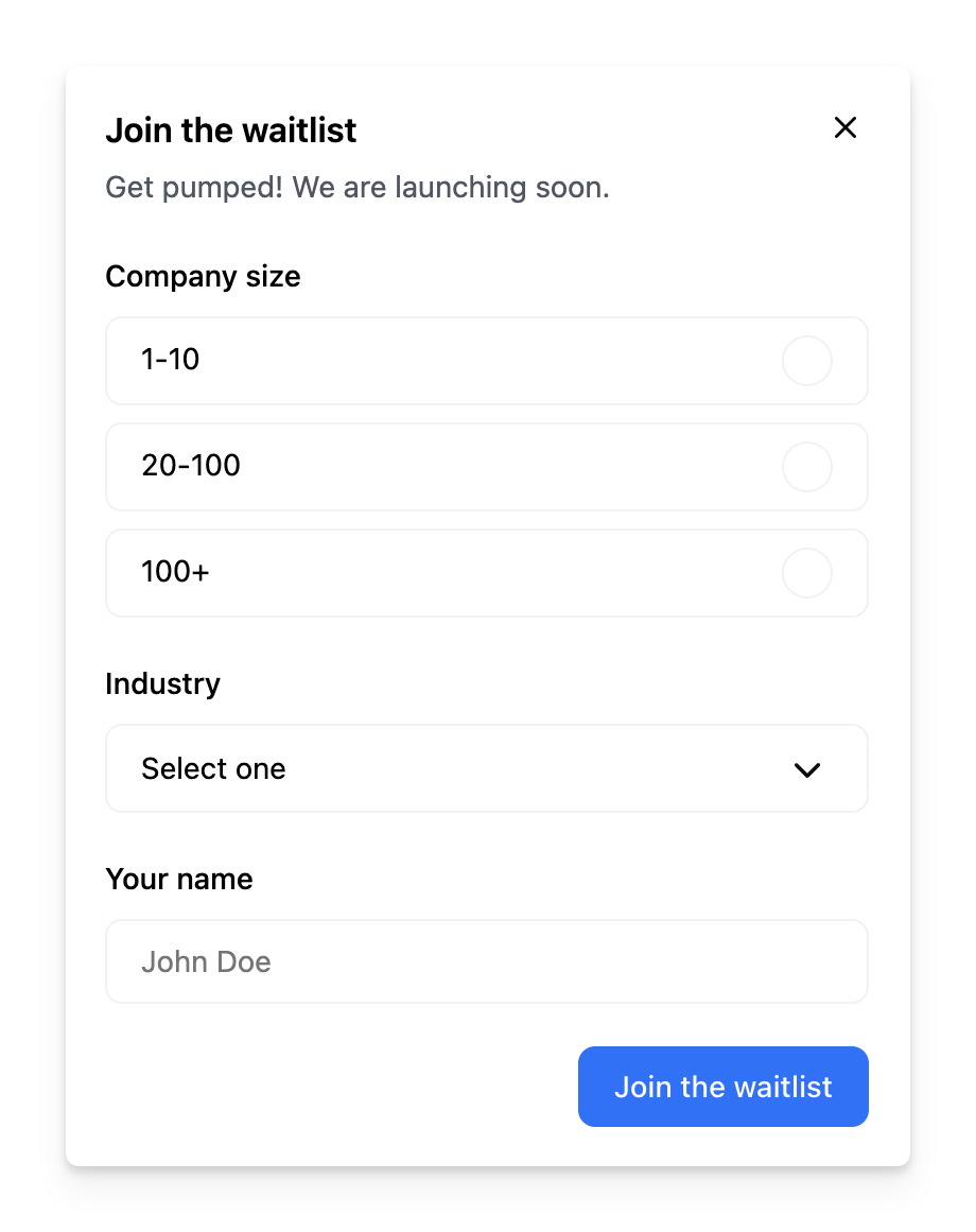
title: Join the waitlist
subtitle: Get pumped! We are launching soon.
primaryButton:
title: Join the waitlist
fields:
- id: company-size
type: radio
label: Company size
options:
- label: 1-10
value: 1-10
- label: 20-100
value: 20-100
- label: 100+
value: 100
- id: industry
type: select
label: Industry
options:
- label: Icecream making
value: icecream
- label: Guitar riffing
value: guitar-riffing
- id: name
type: text
label: Your name
placeholder: John Doe
```
### Churn Survey
```Typescript App.tsx theme={"system"}
import * as Frigade from '@frigade/react';
const App = () => {
return (
) }
```
```yaml Configuration theme={"system"}
steps:
- id: collect-intend
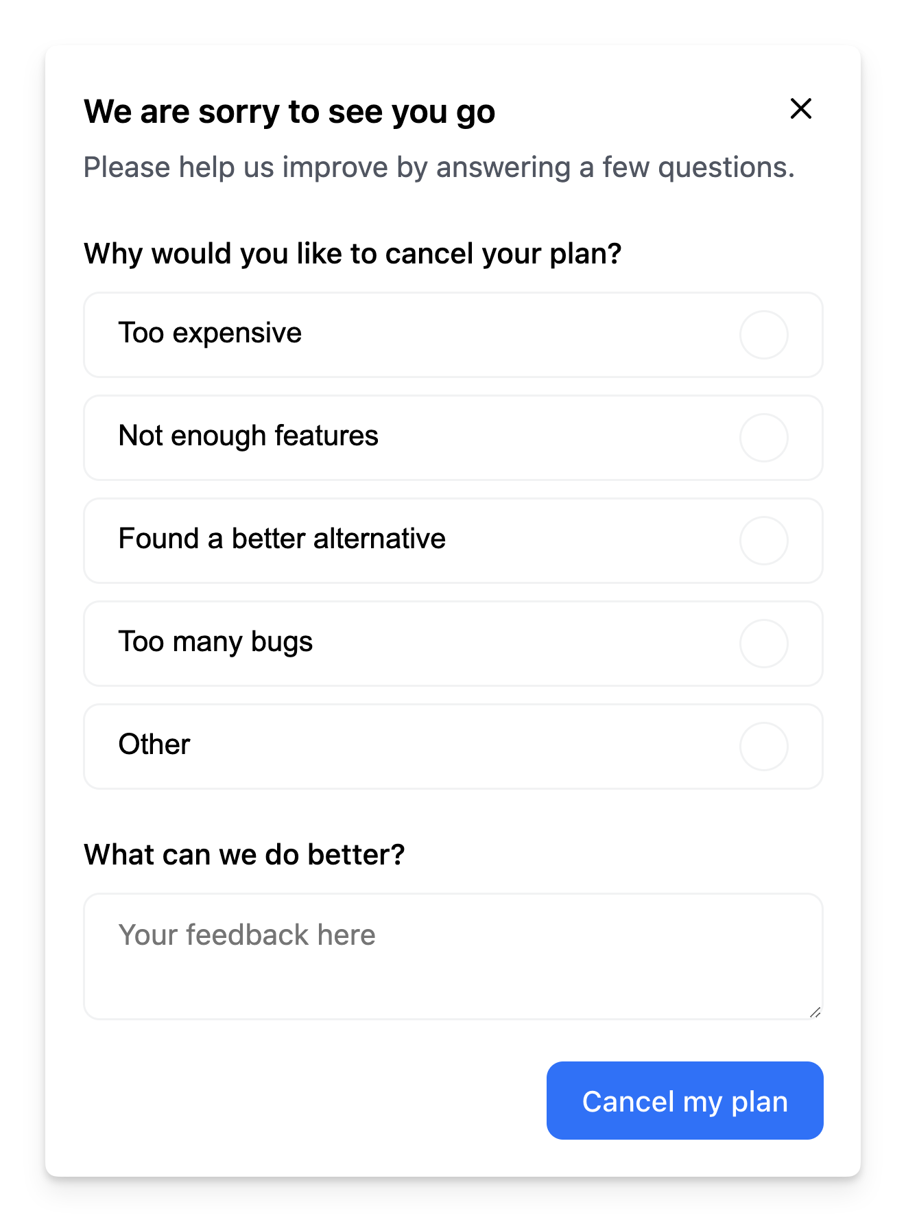
title: We are sorry to see you go
subtitle: We are sorry to see you go. Please help us improve by answering a few questions.
primaryButton:
title: Cancel my plan
fields:
- id: rating
type: select
multiple: true
label: Why would you like to cancel your plan?
options:
- label: Too expensive
value: too-expensive
- label: Not enough features
value: not-enough-features
- label: Found a better alternative
value: better-alternative
- label: Too many bugs
value: too-many-bugs
- label: Other
value: other
- id: feedback
type: textarea
label: What can we do better?
placeholder: Your feedback here
```
### Dynamic Fields
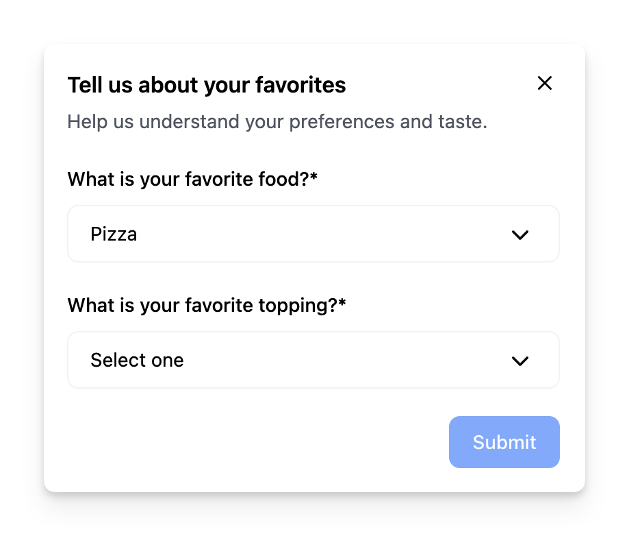
Sometimes you may want to conditionally render a dynamic field based on the value of another field. The example above dynamically changes the second dropdown based on the value of the first dropdown.
This component requires a custom form field for dynamically changing the input. You can achieve this by using the `formContext` provided by react-hook-forms.
In this case, we define a [custom field](/component/form#custom-field-types) type called `DynamicFollowUpBasedOnField` that renders a `SelectField` component.
The options of the `follow-up` dropdown depends on the value of `food`. If the user selects `pizza`, the `follow-up` dropdown will show options for pizza toppings. If the user selects `pasta`, the `follow-up` dropdown will show options for pasta sauces.
```Typescript App.tsx theme={"system"}
import { Form, type FormFieldProps, SelectField } from "@frigade/react";
const App = () => {
return (
### Branching Forms
This example shows how to implement branching in a form based on the user's choice in the first step.
If you want a form to conditionally skip a step based on the result of a previous step, you can use the `visibilityCriteria` property in the step configuration.
For instance, the example below will jump directly to page 3 if the user picks a specific option on the first page/step:
```Typescript App.tsx theme={"system"}
import * as Frigade from '@frigade/react';
const App = () => {
return (
); }
```
```yaml Configuration theme={"system"}
steps:
- id: page-1
title: This is page 1
primaryButtonTitle: Next
fields:
- id: test-radio-1
type: radio
label: Which page do you want to go to?
options:
- label: Go to page 3
value: x
- label: Continue to page 2
value: y
- id: page-2
title: This is page 2
primaryButtonTitle: Next
# Replace the flow ID below with your own
visibilityCriteria: user.flowStepData("my-flow-id", "page-1", "test-radio-1") != "x"
fields:
- id: test-text
type: text
label: Text field
- id: page-3
title: This is page 3
primaryButtonTitle: Finish
fields:
- id: test-radio-3
type: radio
label: Radio group
options:
- label: Radio 1
value: 1
- label: Radio 2
value: 2
- label: Radio 3
value: 3
```
`visibilityCriteria` will work with both form data or any other [Targeting](/platform/targeting#examples) condition.
## Supported Field Types
The component supports the following builtin field types that correspond to their respective HTML input types:
* `select`
* `radio`
* `text`
* `textarea`
* `checkbox`
### Overriding Field Attributes
You can override or add any attribute for a field by using the `props` property in the field configuration.
For instance, this is useful if you want to use the `text` field type, but override the `type` to `email` or `tel`. It can also be used to add any attribute such as a css class, data, or styling.
```yaml theme={"system"}
steps:
- id: step-1
title: This is page 1
fields:
- id: email
type: text
props:
type: email
className: "my-custom-class"
data-attr: "my-custom-data-attr"
style:
color: "red"
```
### Custom Field Types
The Form SDK is built on top of [react-hook-form](https://react-hook-form.com/), which means you can use the majority of its features in your forms. You can define your own custom field types using the `fieldTypes` [prop](#fieldtypes).
For instance, you can implement a simple calendar datepicker field type as such:
```tsx theme={"system"}
import { FormFieldProps } from "@frigade/react";
import * as Frigade from "@frigade/react";
function CalendarField({ field, submit }: FormFieldProps) {
return (
);
}
// ...
;
```
It is also possible to conditionally render a field based on the value of another field by using the [formContext](https://react-hook-form.com/docs/useformcontext) provided by react-hook-form.
For instance, if you want a custom field called `company-size` to show up when a user selects `company` in the `customer-type` field:
```tsx theme={"system"}
import { type FormFieldProps, SelectField } from "@frigade/react";
import * as Frigade from "@frigade/react";
{
const customerTypeValue = props.formContext.watch("customer-type");
if (customerTypeValue !== "company") {
return null;
}
return
My custom conditional field
;
},
}}
/>;
```
## Form Validation
The component supports client-side and server-side validation out of the box. You can define validation rules for each field in the form configuration using the `pattern` property with a regular expression. The example below shows how to validate an email field:
```yaml theme={"system"}
steps:
- id: collect-intend
fields:
- id: email
type: text
required: true
pattern:
message: Please provide a valid email
value: ^[a-zA-Z0-9._%+-]+@[a-zA-Z0-9.-]+\.[a-zA-Z]{2,}$
```
### Server-side Validation
You can perform server-side validation by returning a Promise from the `onPrimary` event handler. If the promise resolves to `false`, the current step in the form will not be marked as completed. The `onPrimary` event handler also contains all form data collected in the session, which allows you to send the data to your server for validation or storage.
```tsx theme={"system"}
import { StepHandlerProp } from "@frigade/react";
import * as Frigade from "@frigade/react";
const App = () => {
const handlePrimary: StepHandlerProp = async (step, event, properties) => {
const response = await fetch("https://my-server.com/validate", {
method: "POST",
body: JSON.stringify(properties),
headers: {
"Content-Type": "application/json",
},
});
if (response.ok) {
return true;
}
// The current step in the form will be marked as completed
return false;
};
return ;
};
```
## Browser Navigation
You can implement browser navigation (back/forward) with your Frigade forms using the [useFlow](/sdk/hooks/flow) hook. This allows users to navigate through form steps using their browser's back and forward buttons.
Here's an example of how to implement this:
```jsx theme={"system"}
import { useFlow } from '@frigade/react';
import { useEffect, useRef } from 'react';
export function FormWithBrowserNavigation() {
const flowId = 'your-flow-id';
const { flow } = useFlow(flowId);
const flowRef = useRef(flow);
// Update ref when flow changes
useEffect(() => {
flowRef.current = flow;
}, [flow]);
useEffect(() => {
if (!flowRef.current) return;
// Handle browser navigation events
const handlePopState = () => {
const currentStepIndex = flowRef.current.getCurrentStepIndex();
const newStepIndex = parseInt(window.location.hash.replace('#step-', '')) || 0;
if (newStepIndex < currentStepIndex) {
// User clicked back - go to previous step
flowRef.current.back();
} else if (newStepIndex > currentStepIndex) {
// User clicked forward - go to next step
flowRef.current.forward();
}
};
// Add event listener for browser navigation
window.addEventListener('popstate', handlePopState);
// Cleanup
return () => {
window.removeEventListener('popstate', handlePopState);
};
}, []);
return (
);
}
```
This example:
1. Uses the `useFlow` hook to get access to the flow instance
2. Uses a ref to store the flow instance and prevent re-renders
3. Sets up an event listener for browser navigation (`popstate`)
4. Handles browser back/forward navigation by moving to the appropriate step using `flow.back()` or `flow.forward()`
5. Cleans up the event listener when the component unmounts
When users click the browser's back button, they'll be taken to the previous step in the form. Similarly, clicking forward will take them to the next step.
## Prefilling a form
Forms can be prefilled by using [Dynamic Variables](/platform/dynamic-variables) by linking the `value` of a `field` to the `variables` prop of the Form component. The example below shows how to prefill a form with the user's name:
```Typescript App.tsx theme={"system"}
import * as Frigade from '@frigade/react';
const App = () => {
return (
) }
```
```yaml Configuration theme={"system"}
steps:
- id: collect-intend
fields:
- id: name
type: text
label: Your name
value: ${name}
```
## Customization
To learn about how to customize Frigade components, see the [customization documentation](/sdk/styling/) and [examples](https://demo.frigade.com) of custom themes in action.
## SDK Properties
Optional component to wrap the child components in, e.g. `as={Dialog}` will render the Flow in a modal Dialog. Defaults to `Box`.
Whether to automatically mark the Flow started (i.e. in progress) when the Flow is eligible to be shown.
You will need to call `flow.start()` or `step.start()` from the parent component if you set this to `false`. Most components should not need to override this behavior.
Defaults to `true`.
Emotion CSS prop to apply to the component. See [Theming documentation](https://docs.frigade.com/v2/sdk/styling/css-overrides) for more information.
Example usage:
```
```
Whether the Flow is dismissible or not
Custom field types to be used in the Form.
You can use this to build your own custom form fields in a `Form`.
For example, if you want to use a custom field type called `calendar`:
```tsx theme={"system"}
import { Form, FormFieldProps } from '@frigade/react'
function CalendarField({ field, submit }: FormFieldProps) {
return (
)
}
// ...
```
The Flow ID to render. You can find the Flow ID in the Frigade dashboard.
If true, the Flow will be mounted even if it has already been completed or dismissed.
However, if the user does not match the Flow's targeting, the Flow will not be mounted.
Register the Flow as a modal to prevent popup collisions (only one modal Flow will render at a time).
Handler for when the Flow is completed. This is event is fired immediately after the user completes the Flow.
Handler for when the Flow is dismissed (skipped). This is event is fired immediately after the user dismisses the Flow.
Handler for when primary button is clicked.
If this function returns false or a promise that resolves to `false`, the step will not be automatically completed when clicked.
Handler for when secondary button is clicked.
If this function returns false or a promise that resolves to `false`, the step will not be automatically completed when clicked.
Variables to pass to the Flow. You can use variables in the Flow configuration to customize copy.
For instance, you can use `title: Hello, ${name}!` in the Flow configuration and pass `variables={{name: 'John'}}` to customize the copy.
The individual steps/pages of the form
Unique identifier for the step. Do not change this once the step has been created.
The title of the step
The description of the step
Url to an image to display in the step
Url to an icon to display in the step. This is only supported by the carousel checklist component.
Url to a video to display in the step such as YouTube, Vimeo, or a direct link to an mp4 file
Config for the primary button in this step.
Primary button action. (defaults to step.complete). **Possible values:** `false`, `flow.back`, `flow.complete`, `flow.forward`, `flow.restart`, `flow.skip`, `flow.start`, `step.complete`, `step.skip`, `step.reset`, `step.start`
Primary button URI target (defaults to \_self).
Primary button title. If omitted, the primary button will not be shown.
Primary button URI.
**Deprecated**: use `primaryButton.title` instead. The title of the primary button
**Deprecated**: use `primaryButton.uri` instead. The url to open when the primary button is clicked
**Deprecated**: use `primaryButton.target` instead. The target of the primary button url (default: \_blank; use \_self to open in the same window). Setting it to # will open the existing page and dismiss any Frigade modals.
Config for the secondary button in this step.
Secondary button action. (defaults to step.complete). **Possible values:** `false`, `flow.back`, `flow.complete`, `flow.forward`, `flow.restart`, `flow.skip`, `flow.start`, `step.complete`, `step.skip`, `step.reset`, `step.start`
Secondary button URI target (defaults to \_self).
Secondary button title. If omitted, the secondary button will not be shown.
Secondary button URI.
**Deprecated**: use `secondaryButton.title` instead. The title of the secondary button
**Deprecated**: use `secondaryButton.uri` instead. The url to open when the secondary button is clicked
**Deprecated**: use `secondaryButton.target` instead. The target of the secondary button url (default: \_blank; use \_self to open in the same window). Setting it to # will open the existing page and dismiss any Frigade modals.
Targeting that automatically completes the step. E.g.: user.property('connectedBank') == true
Targeting that automatically blocks the step from starting until it becomes true. E.g.: user.property('connectedBank') == true
Targeting that automatically shows the step when it becomes true. E.g.: user.property('connectedBank') == true
Override the default UI props for the corresponding component
The data contained on the form step, typically text input boxes, multiple choice questions, etc.
Unique identifier for the step. Do not change this once the step has been created.
The label of the field
The default value of the field (used for prefilling). For checkboxes, use 'true' or 'false'.
Whether the field can accept multiple values. Only used for the `select` type field.
The type of the field. The built-in supported types are: `text`, `textarea`, `select`, `checkbox`, and `radio`. If you are using custom form field types, the name here should match it.
The placeholder of the field
The maximum length of the field
Whether the field is required or not. Use a string here to show a custom error message.
The options for the field. Only used for select fields.
The label of the option
The value of the option
The validation rules for the field. See documentation for more information.
Regex pattern to match the field against
The error message to display if the pattern does not match
Optional additional properties for the field. These will be passed to the frontend component as HTML attributes and merged with the default props for the given field type.
```
```
 ## About this component
The `Form` component is a super versatile tool that can fit right into your product UI or pop up in a modal for things like surveys. They can be used for wide range of use cases including registration flows, surveys, feedback forms, and more. The component supports form validation (client and server-side), conditional fields, branching logic, and multi-step Flows.
**When to Use Forms:**
* **Embedded in UI:** Forms work great for tasks like product registration, helping users get started smoothly without leaving the page.
* **Modal Surveys:** Use forms in modals for surveys or feedback, making it easy for users to share their thoughts without disrupting their experience.
**Why Forms Are Powerful:**
* **Conditional and Branching Logic:** Forms can adapt based on user responses, guiding them through a tailored experience that feels intuitive.
* **Custom React Steps:** You can embed custom React components to invite teammates or perform API lookups, adding a personal touch to your forms.
* **Customizable Input Types:** With a variety of built-in input types—like text fields, multiple-choice options, and dropdowns—you can design forms that suit your specific needs.
**Best Practices for Forms:**
* **Provide Progress Indicators:** Adding progress bars or step indicators (like "Step X of Y") can help users see how far they've come and what's left to do. This makes the process feel less daunting and more manageable.
* **Streamlined Data Collection:** Frigade makes it easy to create new forms quickly, allowing you to gather user data and send it wherever you need it in your system.
## Resources
* Create a form and [send events to Slack](/guides/form-video-demo)
* Launch pop-up forms and surveys with no-code using [Collections](/platform/collections#announcements-surveys-and-dialogs)
* Target your form to specific users with [Targeting](/platform/targeting)
* See [industry examples](https://www.productonboarding.com/?type=form) of forms
## Demo
* See forms in action in our [live demo](https://demo.frigade.com/forms)
## Customization
To learn about how to customize Frigade components, see the [customization documentation](/sdk/styling/) and [examples](https://demo.frigade.com) of custom themes in action.
## Examples
The following section includes ready-made examples and code for various form use cases.
### Simple Modal Form
## About this component
The `Form` component is a super versatile tool that can fit right into your product UI or pop up in a modal for things like surveys. They can be used for wide range of use cases including registration flows, surveys, feedback forms, and more. The component supports form validation (client and server-side), conditional fields, branching logic, and multi-step Flows.
**When to Use Forms:**
* **Embedded in UI:** Forms work great for tasks like product registration, helping users get started smoothly without leaving the page.
* **Modal Surveys:** Use forms in modals for surveys or feedback, making it easy for users to share their thoughts without disrupting their experience.
**Why Forms Are Powerful:**
* **Conditional and Branching Logic:** Forms can adapt based on user responses, guiding them through a tailored experience that feels intuitive.
* **Custom React Steps:** You can embed custom React components to invite teammates or perform API lookups, adding a personal touch to your forms.
* **Customizable Input Types:** With a variety of built-in input types—like text fields, multiple-choice options, and dropdowns—you can design forms that suit your specific needs.
**Best Practices for Forms:**
* **Provide Progress Indicators:** Adding progress bars or step indicators (like "Step X of Y") can help users see how far they've come and what's left to do. This makes the process feel less daunting and more manageable.
* **Streamlined Data Collection:** Frigade makes it easy to create new forms quickly, allowing you to gather user data and send it wherever you need it in your system.
## Resources
* Create a form and [send events to Slack](/guides/form-video-demo)
* Launch pop-up forms and surveys with no-code using [Collections](/platform/collections#announcements-surveys-and-dialogs)
* Target your form to specific users with [Targeting](/platform/targeting)
* See [industry examples](https://www.productonboarding.com/?type=form) of forms
## Demo
* See forms in action in our [live demo](https://demo.frigade.com/forms)
## Customization
To learn about how to customize Frigade components, see the [customization documentation](/sdk/styling/) and [examples](https://demo.frigade.com) of custom themes in action.
## Examples
The following section includes ready-made examples and code for various form use cases.
### Simple Modal Form
 Sometimes you may want to conditionally render a dynamic field based on the value of another field. The example above dynamically changes the second dropdown based on the value of the first dropdown.
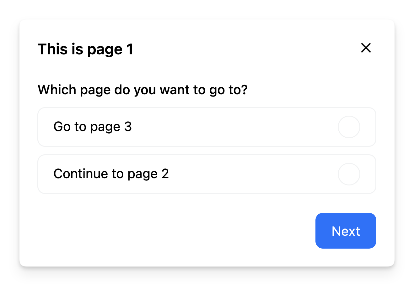 This example shows how to implement branching in a form based on the user's choice in the first step.